




Go Back
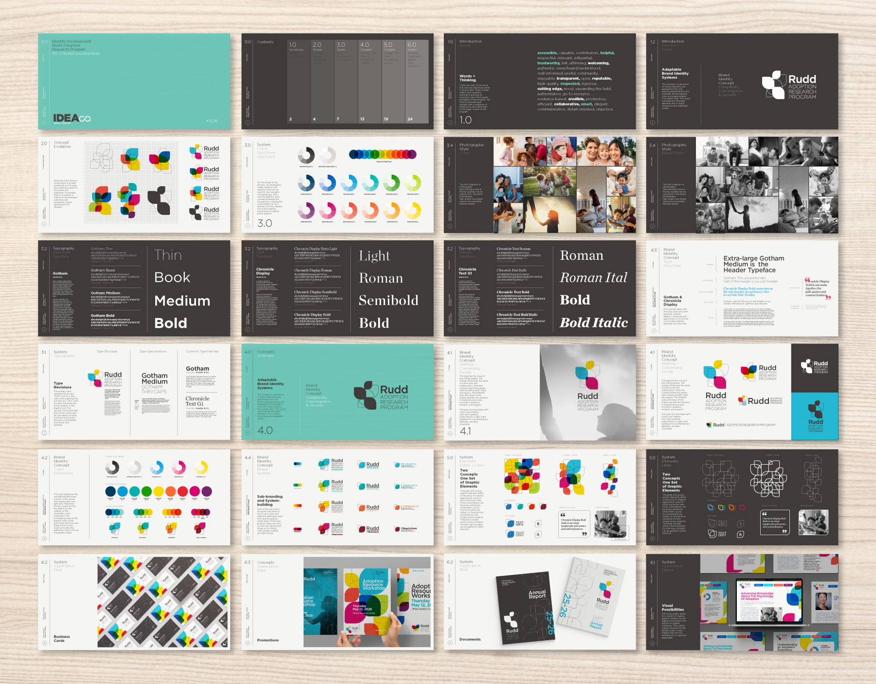
Rudd Adoption Research Program
University of Massachusetts, Amherst
Description:
Growing awareness for adoption research.
Overview:
Brand Identity
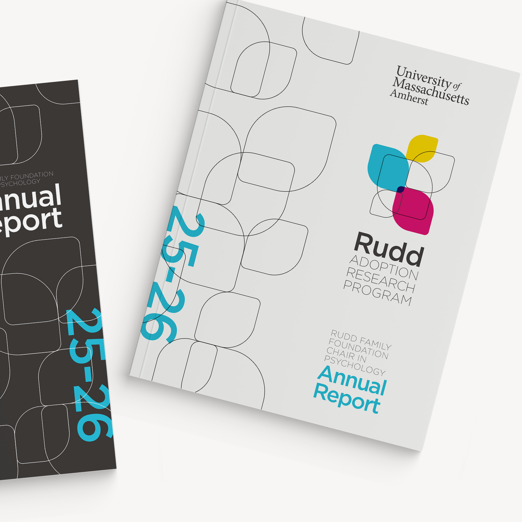
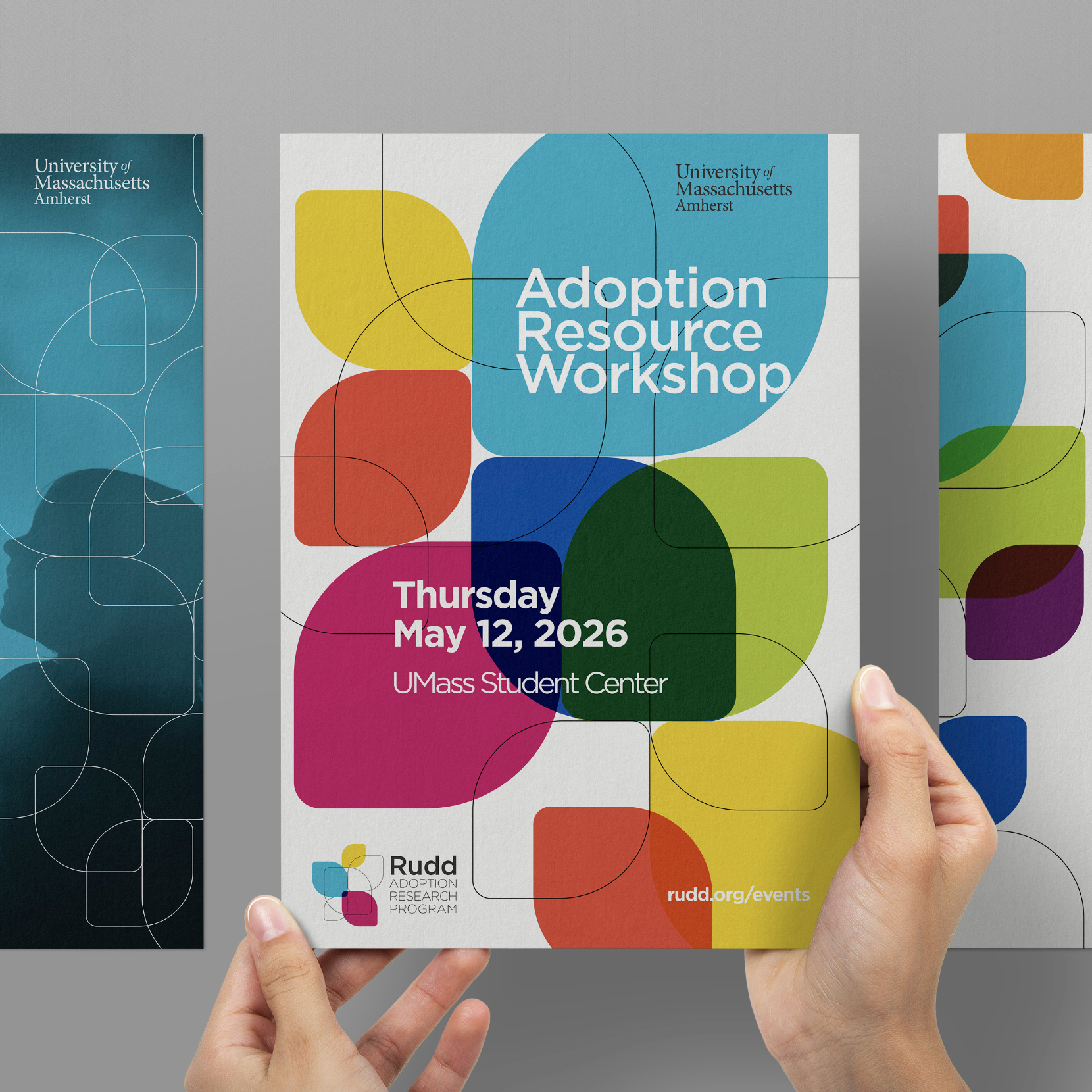
Print Media
Digital Strategy
Industry:
Education

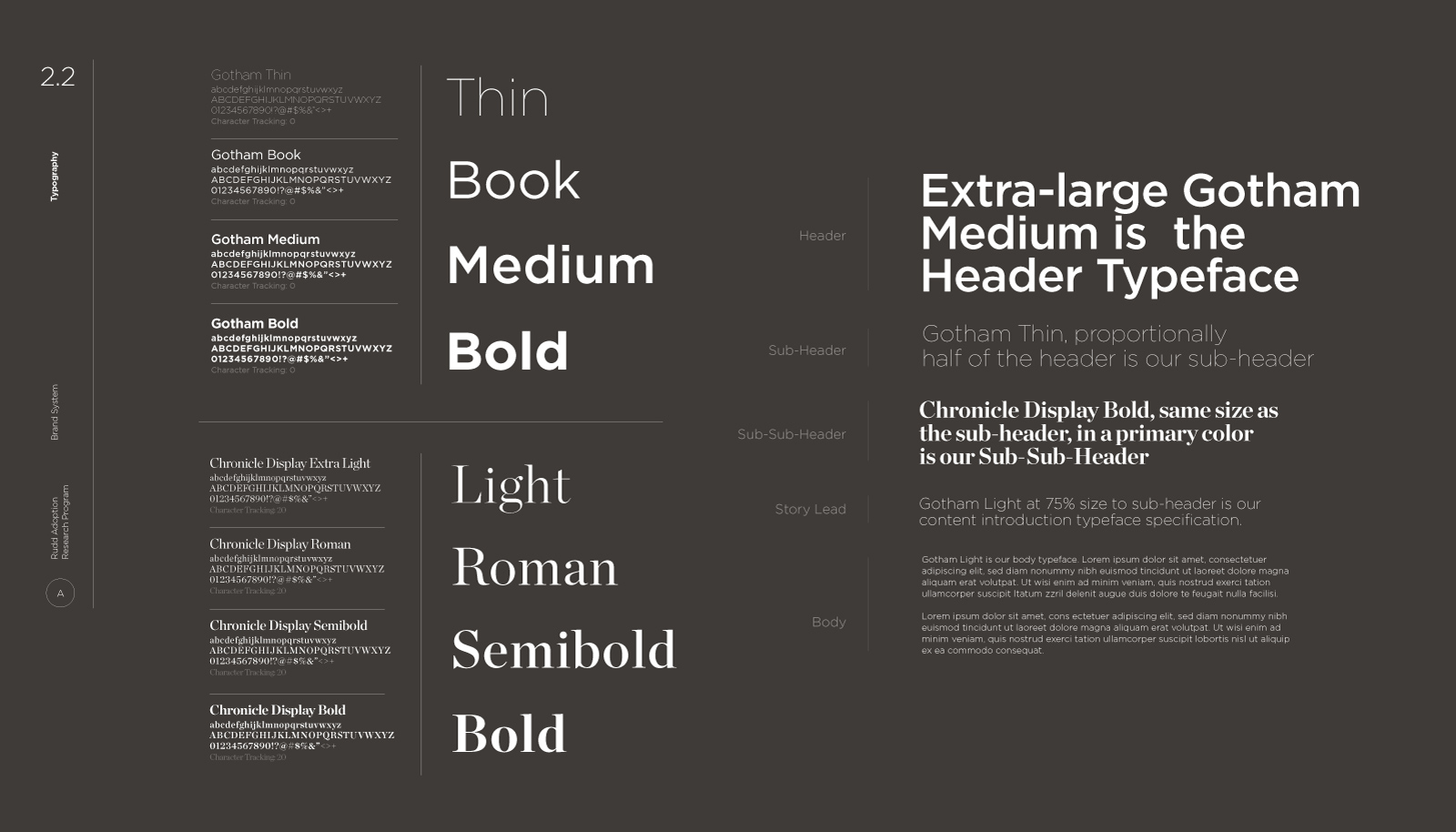
Typopgraphy
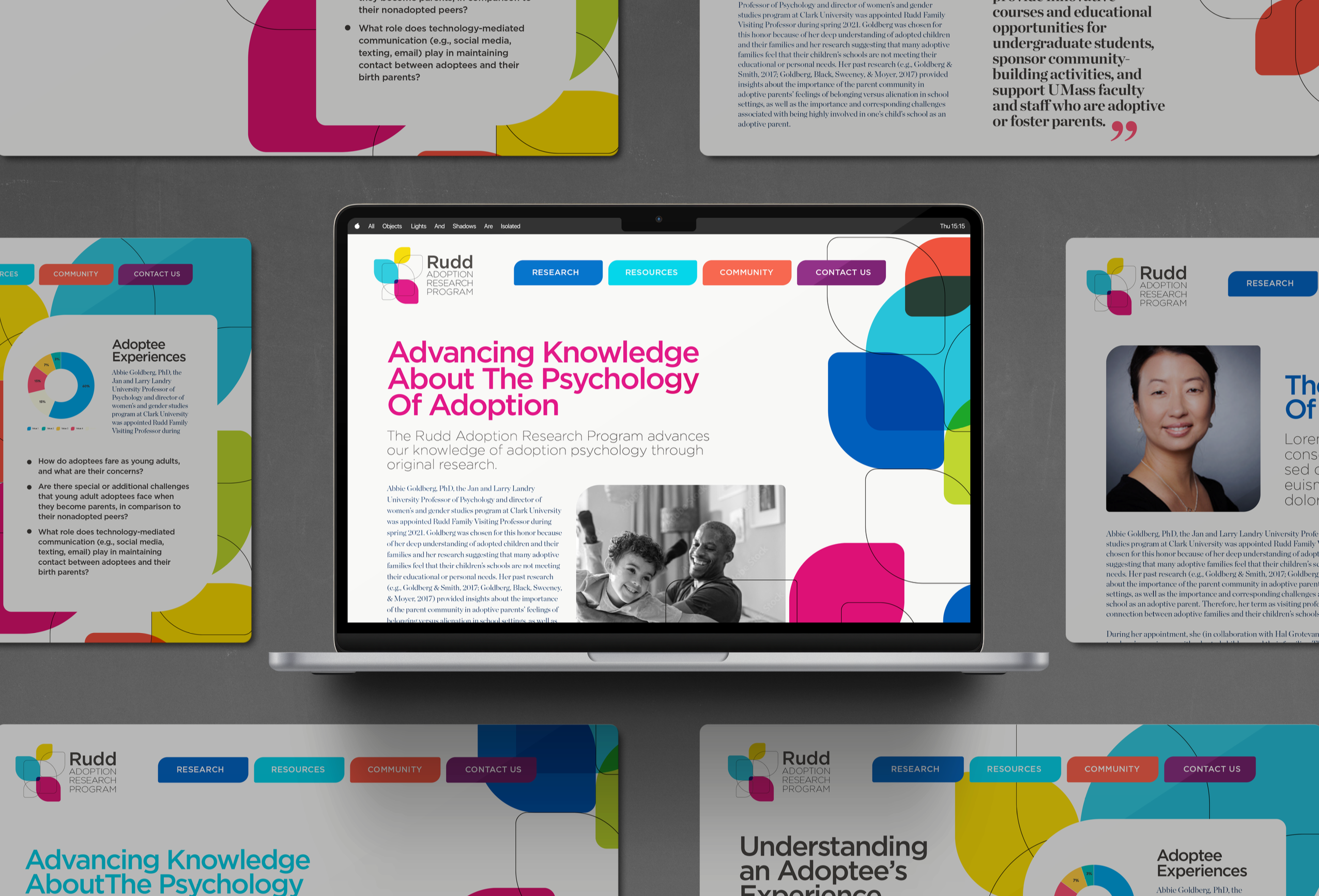
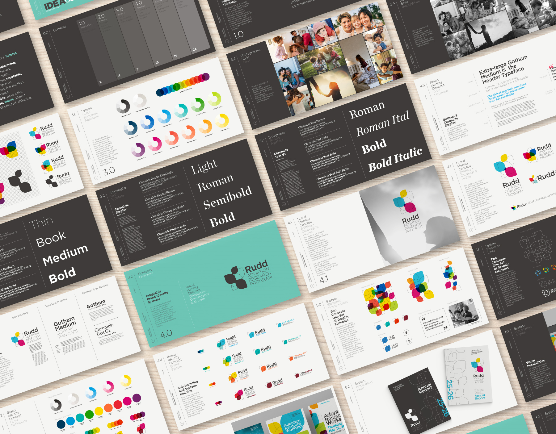
This concept leads with the large, bold sans-serif typeface, Gotham Medium, interlaced with applications of a minimal and modern Gotham typeface and Chronicle.
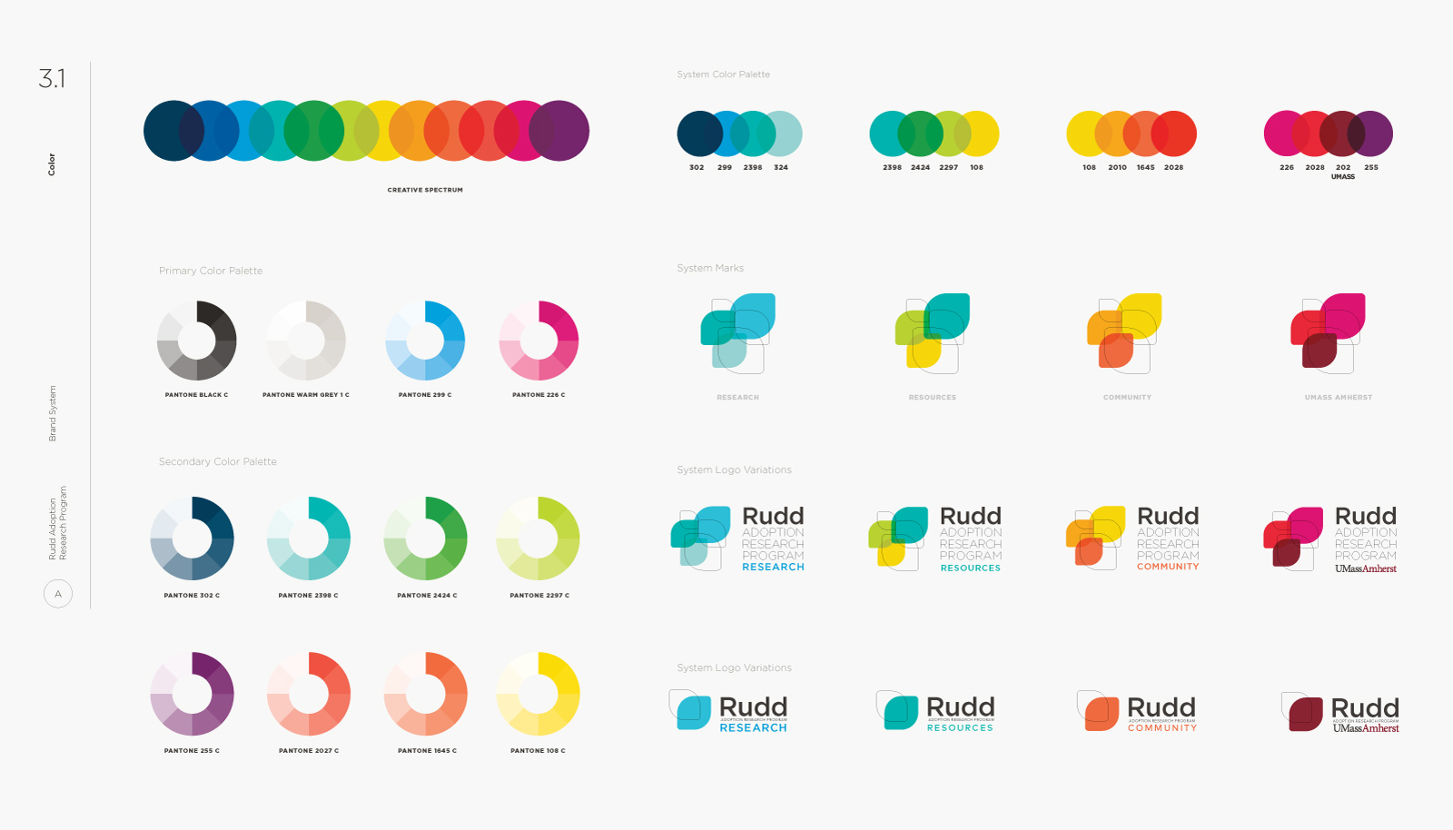
Color
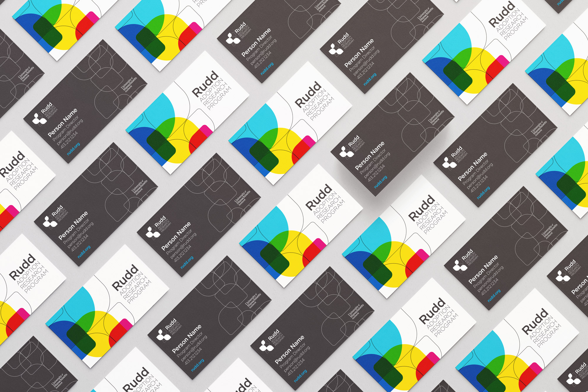
The color palette for this concept features three primary colors, along with a base black and light grey. These four primary colors are the foundation for the creation of the secondary colors produced in the overlapping areas of the graphic. Each of the sub-brand structure uses three of the 12 core colors and adds one additional color to fill out the graphic shape.
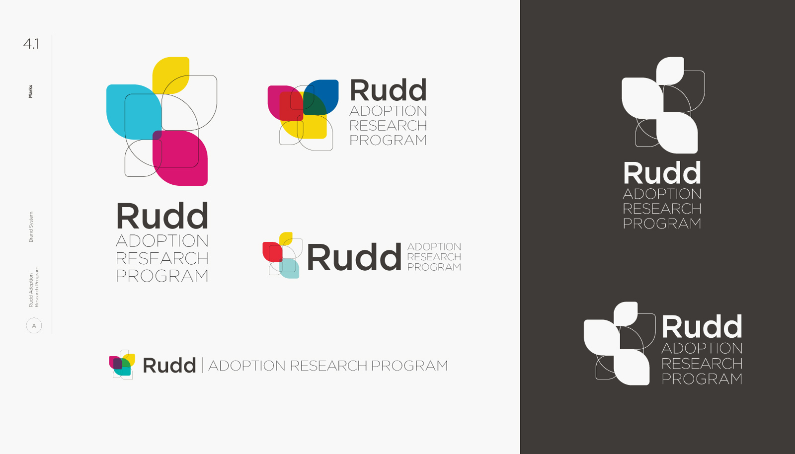
Marks
This explores the visual of the shifting pedals. The overlap showcases the sense of community and collaboration, while the outward stretching pedals demonstrate growth, flight, and agency. The different sizes and styles of the shapes denotes the variation in experience and roles involved in adoption, research, and support. The type structure leads with a bold, but credible sans-serif typeface, supported by a clean, light typeface for a contemporary aesthetic, yet feels accessible.
Patterns
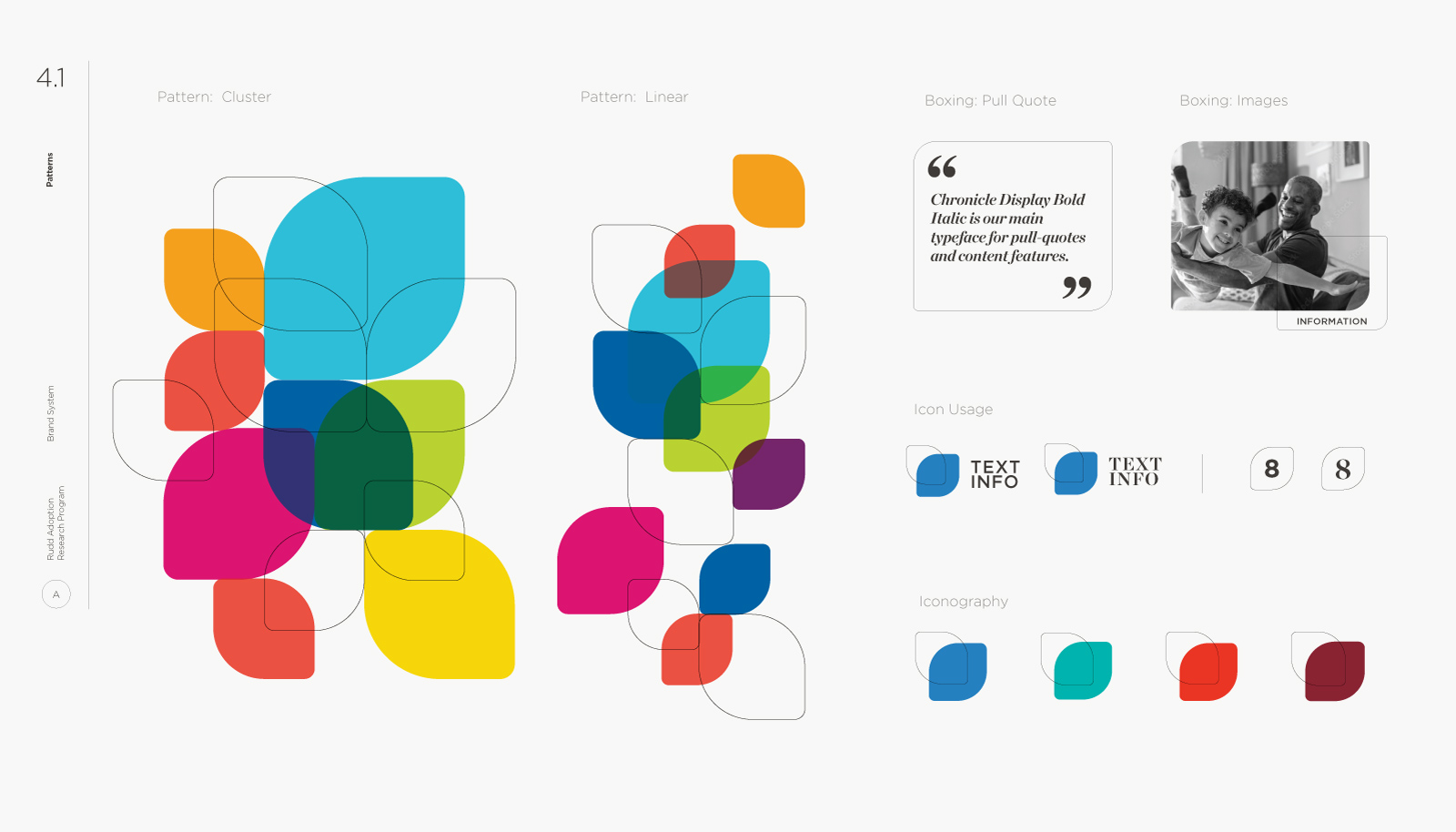
The pedal and overlay graphic elements afford a wide array of creative applications, some of which are shown here. Some combinations can be purely expressive, while others can be structural within the system, or functional as containers for text, images and/or graphics. The pedal concept, which is the foundation for both logo concepts, can be applied to either direction.



Stay up to date with our projects, people, events, and thoughts on design.